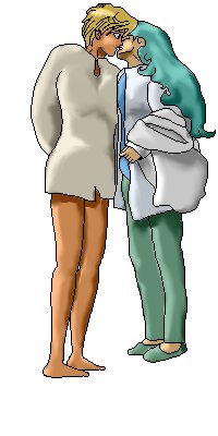
 a - first photo
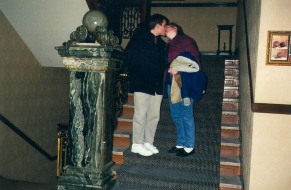
I set out to try get a photo of some friends of mine converted into an anime pic, since they have, they say "based their relationship" on Haruka and Michiru, a couple of Sailor Moon characters. (I imagine this has been somewhat difficult considering that they are not both female, but still...)
I've been using Ben's tutorial pics in a vague kind of way. Very, very useful, and I am forever in his debt for them :-) Must stick in a link to them here at some point, if someone would be kind enough to tell me a site where they are kept. Or must get permission from him to put them up here.
a - first photo
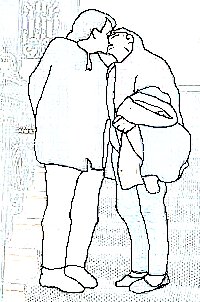
First problem I had was getting a decent outline drawing of the photo. I'm using PaintShop Pro. I get the feeling life may have been scads easier for me had I used Corel Photopaint, but I'm used to PSP, and have no idea how to do anything in the Corel offering, so I opted for that even though I have both. I started with Image/Edge Filters/Trace Contour, which gave me some very rough lines to follow.
 b - first outline
Then I think I made my first mistake. I think I should have resampled the image to about four times it's (200x302) size. This made for fewer pixels to play with, which doubtless made life easier for me, but on the other hand, resulted in loss of detail on their faces later.
I zoomed in a bit, and drew a bunch of lines over those outlines in black, then used the flood fill with a tolerance set to 199 (1 less than maximum) to fill everything that wasn't black with white. Finally, to get rid of anything that was missed, I changed the image to black and white. This left me a lot of black specks, but they were pretty easy to get rid of with a 5 pixel white brush.
 c - crap cleared
That done, I tidied up the lines, and saved (pic n). I saved quite often in fact. Every time I wanted to keep a particular version I would save it one last time, then save it immediately again under a different name, so that I could then do a Ctrl-S reflex save whenever I felt like it, without worrying about saving over the one I wanted to keep. Despite PSP's 'undo' function, I still felt like I needed the protection of regular saves as well.
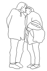 d - lines cleaned
Then I looked for pics of the two anime victims. One in particular seemed OK.
 e - pic from which head was taken
I gave it the same treatment - the outlines from the Trace Contour filter were much easier to follow, because of the black outlines in the original image. Then, because the head was about four times too big for pasting onto the other image, I drew over the lines in a 3 pixel brush, and resized it down.
 f - head rough outlines
To get some idea of whether I was going in the right direction, I roughly filled in the areas of the head with colour.
 g - head cleaned and coloured
I selected the area outside the head (easier than selecting the head directly), inverted the selection area to select the head, and pasted it into the first image. With a little moving around, I could see that some parts (some of the neck and hair) were obscuring the detail, so I went back to the head image, inverted the selection, shift-selected those bits as well, and then inverted again, to get the head without those bits.
That, with a little tidying around the edges, seemed to fit quite well.
 h - head joined on
However, I could tell that the other head was going to be a problem, since it was from an unusual angle, one I don't think I can remember seeing any image of an anime head in. In fact, checking through several hundred megs of images, I can say that it is VERY unusial to see an anime head from under the chin. Even in things like LA Blue Girl, where you'd expect to see it occasionally, given the angles of some of the shots, and given that the girls have a habit of throwing back their heads. But no, you don't, which even makes some of the compositions look rather strange (heads tilted forward at unnatural angles, etc).
So in the end I decided that since it was such a low res pic anyway, I would go with it pretty much as it was, and just accent the chin a little.
Next I concentrated on the hair. If clothes maketh the man, hair maketh the anime character (which is a good thing, or you'd never recognise them in a shower scene...). Trouble was, I had no idea how long the hair was MEANT to be. None of the pictures I had showed anything below the shoulders. So I kindof guessed at that one. Other than that, it was green with gentle curls - not difficult to draw, even for me (and I find almost anything impossible to draw with a mouse).
Next came the bit I was dreading - the hands. Now I for one believe that hands are not possible with a mouse. But I had a bash. I was fortunate that in the whole image there is only one hand.
 i - green hair
Very fortunate in fact. How many of you noticed the extra finger? I only noticed it once the final pic was done, by which time it's a bit late anyway.
That, I decided, was about as far as I could get with their current bodily proportions. Sorry guys, time for the rack...
(Mmm... a cocoa with Bailey's. Nice. Sorry, being diverted here).
I enlarged the canvas (to 200x400), and snapped their poor frail bodies into pieces, at places I thought appropriate to provide anime proportions (ie generally longer and in particular, leggier).
 j - slices
Then I went to work filling in the gaps. It was obvious that Mitchiru's arm going across was now far too short, so I modified the hair to show the elbow, which made it appear longer, and also moved the hand forward a few pixels, which seemed to work, although the sleeve I put to cover the extra arm was very unconvincing. Her hair also now needed extending upwards (it was rather flat to begin with - very unanime. Though with so much hair she was starting to look more like Lum and less like Mitchiru. Oh, well. I slipped the hair back down a few pixels.
Mitchiru's neck was looking a little thick (I can't draw necks. Or some would say I just can't draw...), so I brought in the hair to hide it, which meant I then needed to bring in the edge of the hair again.
Because of the original angle of the photo, Haruka's shoulder looked very hunched, and even knocking it down about five pixels looked a bit campanologistic (that's 'crap' to you), but I left it anyway.
 k - slices filled
I decided that rather than shirt and jeans I would have Haruka wearing a nightshirt, since this would both be more challenging, and would probably look more anime. I decided the shirt would be opaque and loose, not because I wanted to keep the image clean, or keep it looking vaguely like the photo, so much as the fact that I am hopeless at drawing breasts (or some would say...). I deleted the legs completely and printed it out so I could play around with it with pen and paper (lots easier to control!), to get the right shape and curves I wanted. And also so I could sit infront of the Simpsons and drink a little cider and blackcurrant (not as nice as the cocoa, but still enjoyable).
My sketches seemed to show that the various clothes should be hanging slightly differently, so I changed that.
 l - legs gone
After that, I drew in the leg curves I had decided on. None of this bezier stuff for me, straight in there with the pen tool at 1 pixel width. Which is basically because it seems PSP doesn't have a bezier tool. Shame that, it could be useful, though I've never tried it. I think it would be a lot easier to play around with curves to get them just right with beziers. In fact... let's just see if photopaint has them. It does! OK, delete those legs, try again.
Wow. I think I'm in love. Hmm. How do you add extra nodes to your curve? You can't. And the zoom is irritating to say the least. Generally moving around the picture is irritating, and the undo! Grr! But the curves are nice. The legs still aren't any good, but they are a hell of a lot better than they were. And I discovered they were too short, and the feet too big, but those were fairly easy to fix with a combination of the paintbrush and the beziers.
I've discovered that as well as breasts and hands, I also can't draw feet. Or legs. Or anything. *sigh*. Still, onward...
Mitchiru's legs didn't seem to need any modification - they are fine as baggy jeans. The feet are lousy, but then I draw lousy feet.
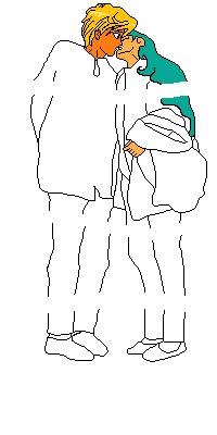
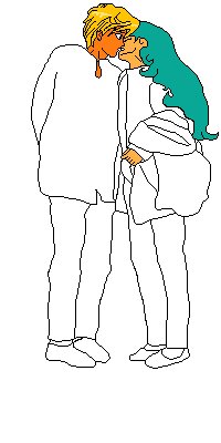
Finally, I started colouring. I chose light, happy colours, and just flood-filled all the areas to begin with. I tried to go for a colour scheme that would match Mitchiru's sailor suit colours - green, blue, and white, though I replaced the white with a very light blue.
Now I have something of about the quality of a low-grade Simpson's fanpic.
 n - coloured
The thing that makes art really stand out is light and shadow - it gives the feeling of depth, shape, movement, texture, and stuff like that. That is, if it's done right. I probably didn't.
First, I made various selections (with the shift-select to select multiple areas, and the magic wand tool to select areas of one colour). I made one of the lines in the image, and one of the background areas, and one of both combined.
Then, I copied the image, converted it to greyscale, and using the combined selection area, filled all parts that were not lines or background with gray. I did this by making the background colour gray, then inverting the combined selection - this selected all the areas I wanted to be gray. Then hitting delete turned them all to the background colour.
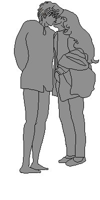 o - gray gif
With some work, and using the combined seleciton area, I was then able to put black and white splodges in roughly the right areas on the image. With the smudge tool, I moved these areas of colour around until they were vaguely right. I say "vaguely". Like I said, I'm crap at breasts.
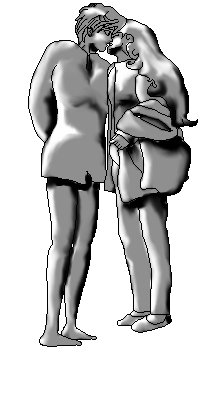 p - shading gif
Then using the image mathematics, I added all channels of both images together, and divided by two.
 q - combined gif
All that was needed now was a decent background. I decided to use the original.
 r - with background
Having pasted the characters on, I inverted the selection, so that they were protected from modification. With the clone tool, it was then easy to eradicate the original people from the picture (much cheaper than renting some mafia people!)
 s - people removed
All that was left to do was shadows and hilights. Had I been thinking ahead, the lighting on the people would have matched my background. Oh, well. I used the smudge tool, set to darken rather than smudge, and by increasing the size of the brush by one pixel for each step up the staircase, was able to get an effect roughly like real life - the shadow gets bigger and fuzzier the farther it gets from the casting object. The effect would have been a lot better had I been more patient with it.
The hilights I did the opposite way - with the lighten tool. They are pretty naff, really. They clash with the lighting already on the characters, so I pretty much left it at the legs.
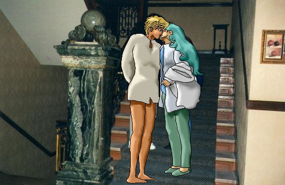
 t - finished
Overall, I'm pretty happy with this as my first ever completely computer generated anime characters. In fact, my first ever anime characters. And my first ever CG art. Given that I have never watched these characters in Sailor Moon, I reckon I have done at least a half decent job on them.
Opinions? Tips? Contact me, and help me make some better artwork for you all!